Girls, great news! Facebook is all for gender equality. This is all thanks to Catlin Winner, Facebook’s design manager. She’s a #winner alright! Sorry, that was lame, I’ll show myself out.
Winner realised something very interesting about the “friends” and “groups” icon. The woman is in the background (How did we not see this?). And she thought this just isn’t right, so our Winner redesigned the logos. This is the first time Facebook’s logos got a make-over.
According to Winner’s post on Medium, she found something in the company glyph kit worth getting upset about.
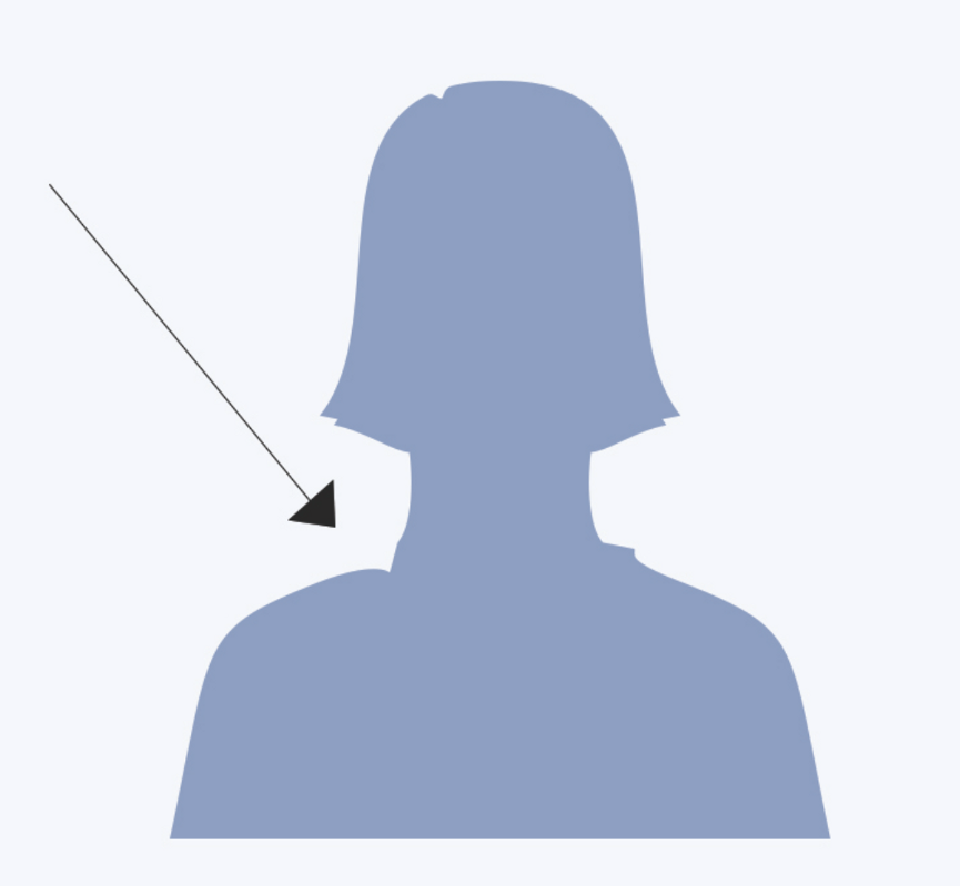
“There in the middle of the Photoshop file were two vectors that represented people. The iconic man was symmetrical except for his spiked hairdo but the lady had a chip in her shoulder.”
This is how the female logo looked; the chip was there because the male logo appeared in front of the female logo.

Winner did not like this and got redesigning. After trying lots of hairdos for our girl, she decided on a stylish bob. Perfect choice! Like Ghandi said “The hair makes the logo”.
This was her process of hairdos:

Then, Winner realised that the male logo looked a bit like an outdated version as well, so he also got a make-over.
Now, the “ Feminism Friends” icon looks like this:

And the “Feminism Groups” icon looks like this:

Yay for gender equality on Facebook! You go Caitlyn! #feminism #Winning (Oh yes I did)

